
my DEPOT 24, a parcel shop that explains itself.
A parcel shop and German delivery address on the Swiss border, moved off a 2016-era website and onto a clear, mobile-first build that tells a visitor from Basel what it does in one headline.
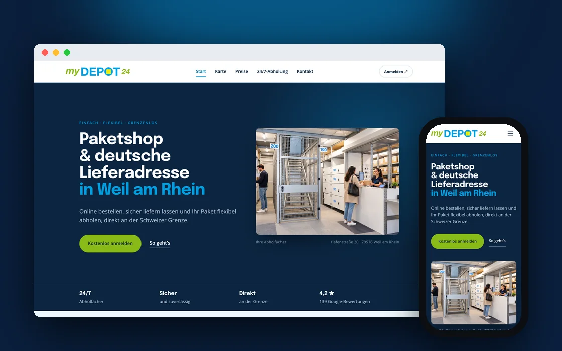
Who is my DEPOT 24?
my DEPOT 24 runs a parcel shop in Weil am Rhein, a few minutes from Basel. Customers in Switzerland shop at German online stores, have their parcels sent to my DEPOT 24’s German address, and pick them up at the counter or from a 24/7 locker.
It is a simple idea that saves people time and shipping costs, as long as the website makes it clear.
- GermanyOrder from any German shopUse my DEPOT 24’s address at checkout.
- Weil am RheinThe parcel arrives at the depotSigned for and stored safely.
- CollectAt the counter or a 24/7 lockerA short trip across the border from Basel.
 Before
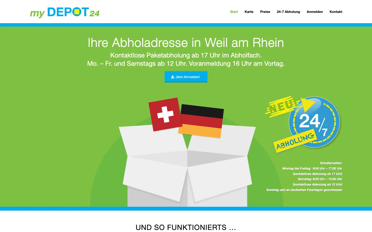
A clever service, hidden behind a dated front page.
The old homepage asked visitors to work the service out for themselves, and the site underneath had not been updated in years.
- Nothing said what it wasA cartoon box and two flags filled the screen.
- Hard to readOpening hours sat in small white text on bright green.
- One small buttonThe only call to action was a small “Jetzt Anmelden!”.
- Stuck in 2016It ran on a WordPress version from early 2016.
Drag to see the difference.
The same business and the same address. One page leaves visitors to guess. The other tells them in a single headline.
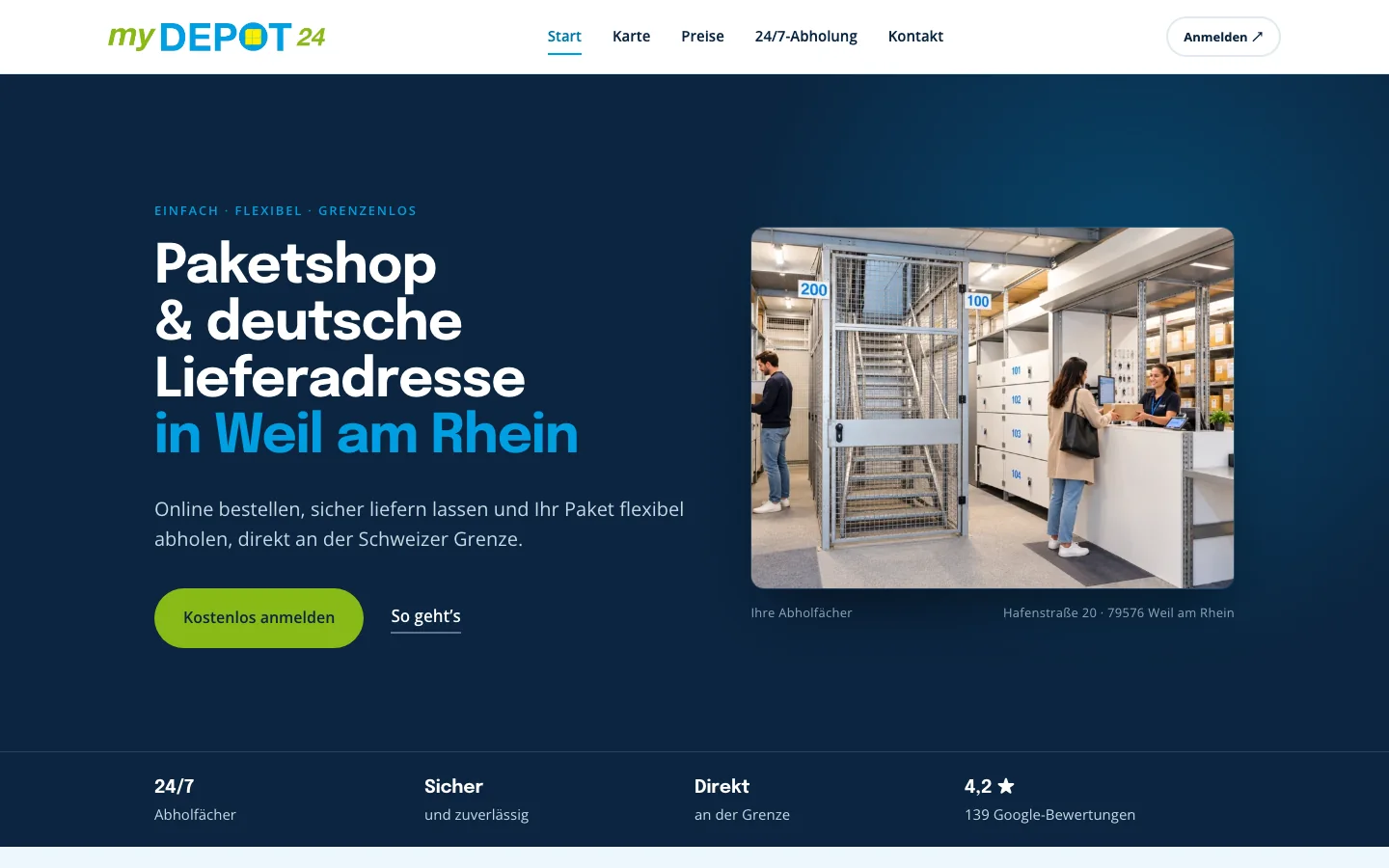 AfterBefore
Drag the handle or use the arrow keys to compare the old homepage with the new one.
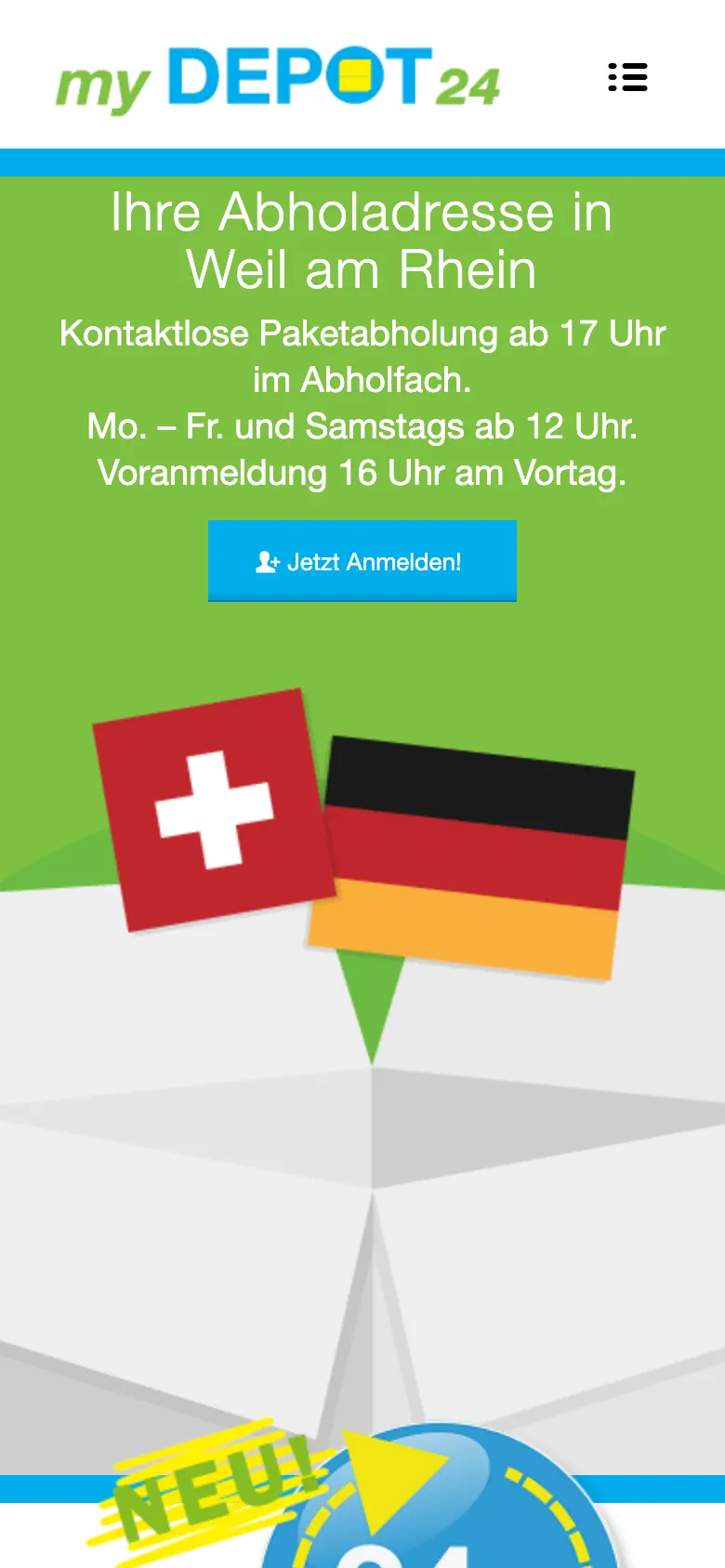
Most visitors arrive on mobile.
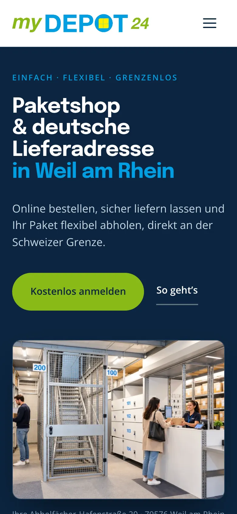
Often on the way to collect. The old layout shrank a cartoon and a green panel onto a small screen. The new one leads with what people came for.
- The headline says what they do and where, in one line
- The sign-up button sits in reach of a thumb
- The address and opening times are one tap away
 AfterBefore
Everything a visitor needs, before the first scroll.
Someone in Basel wants to know four things: what is this, where is it, can I trust it, and how do I start. The new homepage answers all four on the first screen.
- 1
What it is, and where
“Paketshop & deutsche Lieferadresse in Weil am Rhein.” The service and the place, in the headline.
- 2
The depot, not a cartoon
An image of the lockers and counter, captioned with the street address.
- 3
One clear first step
A single green “Kostenlos anmelden” button, the free sign-up.
- 4
Proof, up front
4.2 stars from 139 Google reviews, beside 24/7 lockers and “direkt an der Grenze”.
- 5
Five pages, five questions
Start, map, prices, 24/7 collection and contact. Nothing else in the menu.
Every question gets its own page.
Where is it, what does it cost, and can I collect after hours? Each one now has a page that answers it directly, so nobody has to phone to ask.
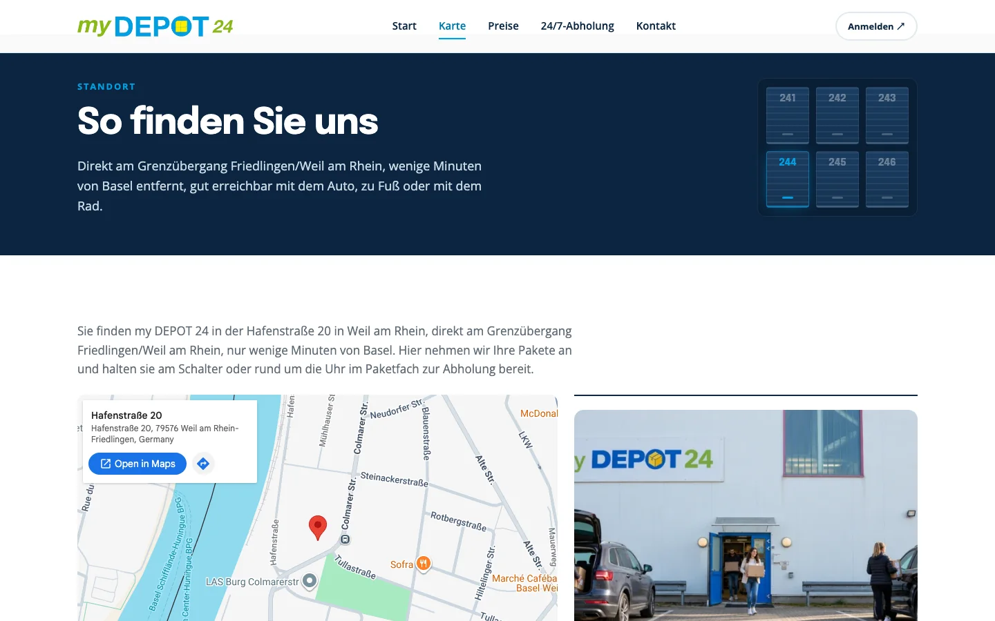
Where is it?
The address, an image of the building and one tap to open directions.
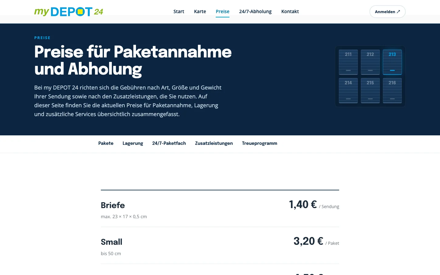
What does it cost?
Clear tabs for parcels, storage, the 24/7 locker, extras and the loyalty scheme.
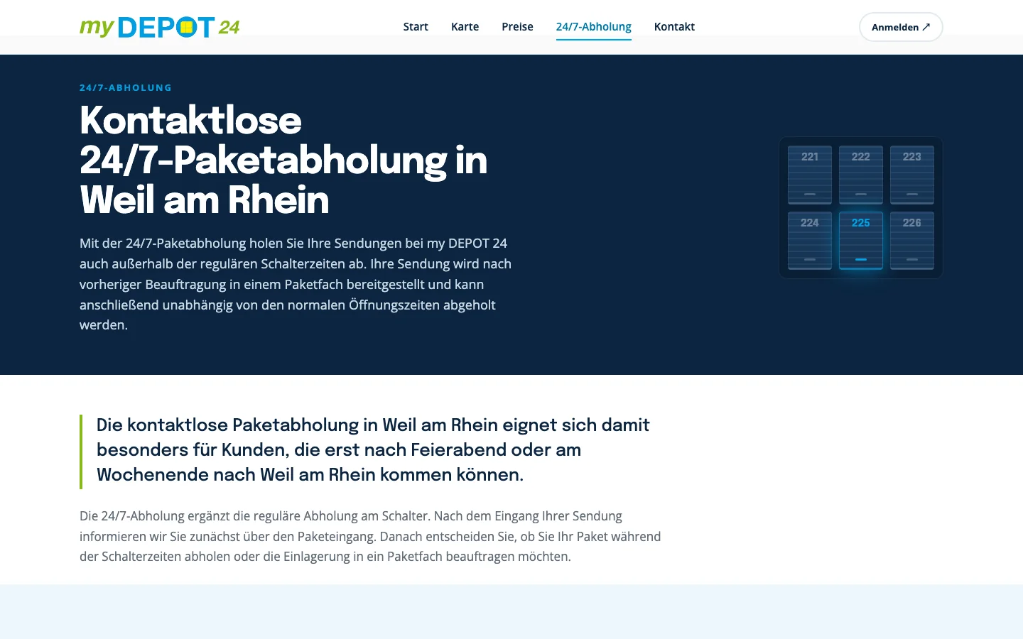
Can I collect after hours?
How the 24/7 lockers work, step by step.
A website that explains the service before the first scroll.
A visitor from Basel now lands on a page that says what my DEPOT 24 does, where it is and how to start, with reviews to back it up. Prices, directions and the 24/7 lockers are one tap away on any phone, and the brand’s blue, green and yellow logo sits in a calmer, modern layout the team can keep up to date.
The principleA simple service deserves a simple site.
Order, deliver, collect. If the website takes longer to explain that than the service takes to use, the website is the problem.
Does your website explain your business in one line?
See the my DEPOT 24 site live, or get a free audit of what your current site might be costing you.