
When it comes down to it, improving your website’s user experience is all about one thing: making your site easy and enjoyable for people to use. It's about creating navigation that just makes sense, ensuring pages load in a snap, and having a visual design that helps visitors get what they need without any fuss.
Building a User Experience That Actually Converts
Before we get into the nuts and bolts, let's be clear on something: user experience (UX) is the absolute foundation of your online success. It’s not just about making things look pretty. It's the sum of every interaction someone has with your website, and that experience directly shapes how they see your brand.
Think of it this way: a great UX is like a welcoming, well-organised shop where everything is easy to find. A poor UX is a cluttered, confusing mess where customers walk out frustrated.
A positive experience keeps people on your site, builds their trust, and gently guides them towards taking action—whether that’s buying something or getting in touch. When you get this right, the impact on your business is real and measurable.
Here's what a strong focus on user experience can deliver:
- Higher Conversion Rates: When the path is clear and simple, more people will complete their goal, like making a purchase. You can find more on this in our guide on how to increase conversion rates.
- Improved SEO Rankings: Search engines, especially Google, actively reward websites that offer a great user experience with better visibility in search results.
- Increased Customer Loyalty: A good experience makes people want to come back. It’s a simple way to build a lasting relationship with your audience.
To really turn those clicks into customers, you need proven strategies to convert website visitors into buyers. The whole point is to remove any friction and create a smooth journey from the moment they land on your site to the moment they convert.
The Core Pillars of Effective UX
Every website that feels good to use is built on a few core principles. These are the non-negotiables that work together to create that seamless feeling for your visitors.
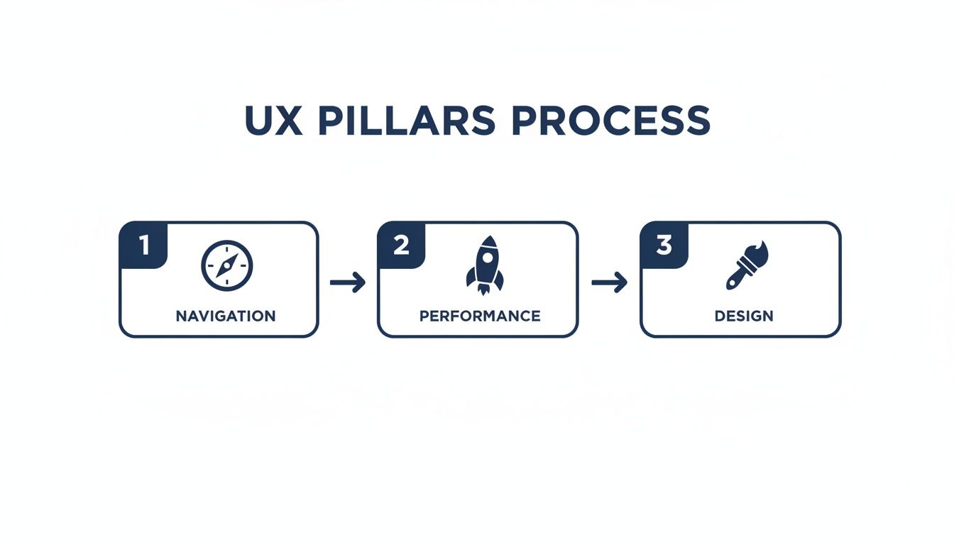
As you can see, it's not about nailing just one thing. Great navigation, speedy performance, and clean design are all interlinked. You have to get all three right to deliver a genuinely superior experience.
Think about it from a user's perspective. They might love your design, but if the site takes forever to load, they're gone. A lightning-fast site with a confusing menu is just as bad. It all has to work in harmony.
To give you a clearer picture, here's a quick breakdown of these essential pillars.
Key Pillars of Website User Experience at a Glance
| UX Pillar | Primary Goal | Key Metric to Track |
|---|---|---|
| Navigation | Help users find what they need quickly and effortlessly. | Bounce Rate / Pages per Session |
| Performance | Ensure the site loads fast and responds instantly to user actions. | Page Load Time / Core Web Vitals |
| Design | Create a visually appealing and intuitive interface. | Conversion Rate / Time on Page |
This table serves as a handy reference point as we dive deeper. Each pillar supports the others, and improving one often has a positive knock-on effect.
A great user experience isn't an accident. It's the result of a deep understanding of your users' needs and a commitment to meeting them at every click. It turns visitors into customers and customers into advocates.
Ultimately, putting time and effort into your site's UX isn't just a cost—it's a direct investment in your business's growth. A website that is easy to navigate, fast to load, and pleasant to look at will always outperform one that isn't. In the sections that follow, we'll walk through exactly how to improve each of these core pillars.
Stop Guessing and Start Understanding Your Users

Here’s the single biggest mistake I see businesses make: they assume they know what their users want. To genuinely improve website user experience, you have to get out of your own head and start listening to the people actually using your site.
This means stepping into their shoes, feeling their frustrations, and seeing your website through their eyes for the first time.
This whole process is called user research, and it isn't just for massive corporations with bottomless budgets. You can get powerful, game-changing insights with simple methods that reveal exactly what’s broken. It's the difference between blindly changing button colours and realising a confusing checkout process is costing you thousands.
Create Simple, Powerful User Personas
Before you can solve a problem for someone, you need to know who they are. That’s where user personas come in. They are essentially semi-fictional profiles of your ideal customers, built from real data and insights. They turn abstract analytics into relatable people with real goals and pain points.
You don't need to overcomplicate this. A simple persona is often the most effective. Instead of a generic "small business owner," let's create "David, the London-based self-storage owner."
- Who is he? David is 45 and manages three self-storage sites. He’s comfortable with tech but always short on time.
- What does he need? He needs to book a unit for a new client quickly during his short lunch break.
- What frustrates him? He can’t stand websites with hidden contact numbers, long forms, and pages that crawl on his mobile.
With David in mind, every decision becomes clearer. Would this navigation menu make sense to him? Is this form short enough for someone with only ten minutes to spare? Personas give your design and content a much-needed human focus.
Gather Real Feedback from Real People
Assumptions are dangerous; direct feedback is gold. You need to open a channel for users to tell you what they really think. Two of the most straightforward ways to do this are on-site surveys and feedback widgets.
On-site Surveys: Use simple pop-ups or embedded forms to ask specific questions at crucial moments. For example, a quick survey on your checkout confirmation page asking, "How easy was it to complete your booking today?" gives you immediate insight into your most important user journey.
Feedback Widgets: A subtle "Feedback" tab tucked away on the side of your pages lets users report issues or share ideas whenever they feel the need. This empowers them to flag things you’d never spot yourself, like a broken link or a confusing sentence. The trick is to make it easy and unobtrusive.
Remember, the goal isn't just to collect data, but to understand the 'why' behind it. A low survey rating is a signal, but a user's comment explaining why it was a bad experience is your roadmap for improvement.
See What Users Do with Heatmaps
While surveys tell you what users think, heatmaps show you what they actually do. These tools create a visual overlay on your website, showing where people click, how far they scroll, and what they ignore completely.
They are an incredibly powerful tool for diagnosing user behaviour. For a deeper dive, check out our guide on understanding, analysing, and improving user engagement on your website.
Here’s what you can uncover:
- Click Maps: These show precisely where users click. Are they clicking on images or headlines that aren't links? That's a clear signal of user frustration and a missed opportunity.
- Scroll Maps: These show you how far down a page most users get. If your main call-to-action is at the bottom but 75% of users never scroll that far, you’ve got a major problem.
- Move Maps: By tracking mouse movement (which often follows a user's gaze), these maps show which parts of your page draw the most attention.
Imagine you’re looking at a heatmap for a key service page and you see that almost no one is clicking your "Get a Quote" button. Instead, you see a flurry of clicks on an unlinked image next to it. That's a clear, actionable insight. You can immediately test making that image a link and see if conversions jump. This is how you move from guesswork to making real, data-driven improvements.
Designing a Clear Path for Your Visitors
If someone lands on your website and can't figure out where to go in the first few seconds, they're gone. A confusing layout is the digital version of a shop with no signs or clear aisles—it’s frustrating, and it sends potential customers straight to your competitors. This is precisely why a logical site structure is non-negotiable for a great user experience.
We call this structure Information Architecture (IA). It sounds technical, but it’s really just about organising your website’s content so it makes perfect sense to your visitors. The whole point is to build a clear, intuitive path that guides them exactly where they need to go, whether that’s finding a price, booking a service, or simply getting in touch.
Think of it as removing friction. Every unnecessary click or moment of head-scratching is a barrier. A well-thought-out path makes their journey feel effortless, which makes it far more likely to end in a sale or a lead for you.
Start with a Simple Site Map
Before you get lost in colours and fonts, you need a blueprint. A site map is just a basic diagram showing how all your pages connect. You don't need fancy software for this—a pen and paper or a simple flowchart tool will do the trick.
Put your homepage at the top and branch out from there. What are the absolute most important things a visitor would want to find? Make those your main navigation links.
For instance, if you run a self-storage business, your key pages would probably be:
- Unit Sizes & Prices: The first question on most people’s minds.
- Our Locations: Helping them find the nearest facility.
- How It Works: Demystifying the rental process.
- Contact Us: Making it dead simple to ask a question.
This simple exercise forces you to see your site through your customer's eyes and ensures your most important content is never buried more than a click or two deep.
Use Language Your Customers Understand
One of the fastest ways to make your site easier to use is to drop the corporate jargon. Use the same words your customers use. Your navigation labels should be so clear they’re impossible to misunderstand.
Let's stick with the self-storage example. A generic menu item like "Products" is vague. Is that boxes? Insurance? The units themselves? Switching that to "Unit Sizes & Prices" leaves zero room for doubt. The user knows exactly what they’ll find before they even click.
A great website speaks its users' language. When your navigation is intuitive, visitors don't have to think—they just click. This builds confidence and keeps them moving smoothly towards their goal.
This same thinking applies to your calls-to-action (CTAs). Instead of a lifeless "Submit" button on a form, try something more descriptive like "Get My Free Quote" or "Check Availability Now". Being specific reduces uncertainty and really boosts engagement.
Keep Your Navigation Clean and Focused
When it comes to your main menu, less is more. Overloading it with options triggers "analysis paralysis"—a real phenomenon where people get so overwhelmed by choice they just give up.
Try to stick to a maximum of five to seven main navigation items. This keeps the choices manageable and the design uncluttered, which is especially important on mobile where screen space is precious. If you have more pages, group them logically into dropdown menus under the most relevant heading.
This minimalist approach forces you to prioritise, guiding users towards the actions that really matter to your business.
Personalisation is also becoming a huge part of creating a focused experience. Here in the UK, a massive 88% of online shoppers say they’re more likely to buy from sites that offer a personalised experience. And with 38% of users admitting they’ll abandon a site with a confusing layout, even simple A/B testing can make a world of difference. You can read more about these customer experience statistics and trends to see how these insights can help.
Finally, think about adding breadcrumbs. These are the little navigational trails you see at the top of a page (e.g., Home > Services > Self-Storage) that show people exactly where they are. They provide context and give users a confident way to go back a step without mashing the "back" button. It’s a small detail that helps visitors feel in control of their journey.
Winning the Race with a Faster Website

Let's be blunt: a slow website is one of the fastest ways to lose a customer. In the battle for online attention, even a one-second delay feels like an age and is often all it takes to send a potential client clicking over to your competitor. Site speed isn't just a technical box to tick; it's a cornerstone of a good user experience.
Search engines like Google also put a huge emphasis on performance. So, a zippy website doesn't just keep your visitors happy—it directly helps you climb the search rankings. The great news is you don’t need to be a coding wizard to make a real difference to your site's load times.
A few smart, powerful changes can turn a sluggish site into a slick one, leading to lower bounce rates and a much smoother journey for everyone who lands on your page.
Master the Art of Image Optimisation
Huge, high-resolution images are usually the main offenders when it comes to slow pages. Of course, you need crisp visuals to show off what you do, but unoptimised files can bring your site to a screeching halt, especially on mobile phones.
The first, non-negotiable step is compression. Before you even think about uploading an image, run it through a compression tool. This shrinks the file size without any noticeable drop in quality, and there are plenty of free online tools that get the job done in seconds.
Next up, get familiar with modern image formats. Formats like WebP are a game-changer, offering much better compression and quality than old-school JPEGs and PNGs. Nearly all modern browsers support WebP, and many content management systems have plugins that will convert your images automatically.
- Compress Every Image: Slash the file size before it ever gets to your website.
- Switch to WebP: Use this next-gen format for the perfect balance of quality and size.
- Implement Lazy Loading: This clever trick only loads images as they’re about to scroll into view, making that initial page load lightning-fast.
Tidy Up Your Code and Scripts
Behind the scenes, your website is built with code—HTML, CSS, and JavaScript. Over time, these files can get clogged with unnecessary characters, developers' comments, and extra spaces, all of which add to the loading time. Cleaning this up is a process called minification.
Minification strips out all the non-essential junk from your code files, making them smaller and quicker for browsers to download and read. It might sound terribly technical, but countless plugins and automated tools can handle it for you with a single click.
Think of it as decluttering a messy room. By getting rid of the clutter, you make it much easier for a browser to find what it needs and build the page for your visitor. For a more detailed walkthrough, you can find some great advice in our guide on how to improve website loading speed.
Understand and Improve Core Web Vitals
Google uses a specific set of metrics, called Core Web Vitals, to measure the real-world user experience of a website. These metrics look at loading speed, how quickly users can interact with the page, and whether things jump around as they load. They also play a direct role in your search rankings.
Here’s a quick breakdown in plain English:
- Largest Contentful Paint (LCP): How long does it take for the biggest piece of content (like a banner image or a large block of text) to appear? You should be aiming for under 2.5 seconds.
- First Input Delay (FID): How quickly does your site react when someone clicks a button or taps a link? This needs to be less than 100 milliseconds.
- Cumulative Layout Shift (CLS): Do elements on the page shift about unexpectedly as it loads? A low score here means a stable, less frustrating visual experience.
Improving your Core Web Vitals isn't just about keeping Google happy. These metrics are a direct reflection of your user's experience. A good score means your site feels fast, responsive, and stable to a real person.
The Real-World Impact of Speed in the UK
The demand for speed is particularly high among UK users. Research shows that UK sites need to load in under 2.6 seconds on desktop to stay competitive, as just a one-second delay can slash conversions by 7%.
In fact, a staggering 54% of users will give up and leave a website that takes longer than three seconds to load. In contrast, sites that manage to cut their load time from eight seconds down to two see a 74% increase in conversions. For Amax clients like Aerospheres, simple speed tweaks were a game-changer that helped to surge their traffic.
Ultimately, winning the race with a faster website comes down to respecting your visitor's time. By putting these practical steps into action, you create a better experience that directly supports your business goals.
Making Your Website Work for Everyone
A great user experience is an inclusive one. Let's be clear: web accessibility isn't just a box-ticking exercise for compliance. It’s about throwing the doors open to a wider audience and, in the process, making your site better for every single visitor. These thoughtful adjustments don't just help users with disabilities—they almost always improve your SEO and create a smoother experience across the board.
Here in the UK, this is especially crucial. With over 14 million people living with some form of disability, making your website accessible is both a legal and commercial imperative. The Web Accessibility Regulations 2018 lay this out clearly, but the business case is just as compelling. Brands that get this right see an average 18% year-over-year traffic increase, and UK e-commerce sites with accessible designs have reported user engagement jumping by 23%. You can dive deeper into related data with these UK social media statistics and trends.
Don't think of this as a massive overhaul. It's about a series of small, powerful changes that can completely transform how people interact with your content.
Add Meaningful Alt Text to All Images
Every image needs alternative text, or 'alt text'. Think of it as a short, written description that steps in when the image can't be seen. For visitors using screen readers, it’s absolutely essential—it’s how they 'see' your visual content. It's also what shows up if an image breaks, and it gives search engines valuable clues about your page.
Good alt text gets straight to the point. Instead of just writing "dog," you'd want something like, "A golden retriever catching a red ball in a sunny park." See the difference? It paints a picture.
Ensure Sufficient Colour Contrast
If people can't read your text, your message is lost. It’s that simple. When your text colour is too close to your background colour, it's a strain for everyone, but for users with visual impairments like colour blindness, it can make your site completely unusable.
Thankfully, this is easy to check. Grab a free online contrast checker and test your colour combinations against the official Web Content Accessibility Guidelines (WCAG). My advice? For main body text, you can rarely go wrong with dark text on a light background. It just works.
Accessibility is not a feature, it’s a mindset. Building an inclusive website from the start is more efficient than retrofitting one later. It ensures you’re not just building for some of your audience, but for all of it.
Design for Keyboard-Only Navigation
Remember, not everyone uses a mouse. Many people with motor disabilities, along with quite a few power users, navigate the web using only their keyboard. You can—and should—test this on your own site right now.
Put your mouse aside and try to get around using only the Tab key.
- Does the focus move logically from one element to the next—links, buttons, form fields?
- Is it obvious which element is currently selected? Look for a clear highlight or outline.
- Can you actually use things, like opening a menu or submitting a form, with the Enter key?
If you ever get stuck or lose track of where you are on the page, you've just found an accessibility barrier that needs to be fixed.
Use Clear and Descriptive Link Text
Links that just say "click here" or "read more" are a real headache for screen reader users. When a screen reader pulls a list of all the links on a page, a list of ten "click here" links is utterly useless. It gives the user no context whatsoever.
The fix is simple: write link text that describes where the link goes.
- Avoid: To download our brochure, click here.
- Use: You can download our latest self-storage brochure.
This tiny change makes a world of difference for people using assistive technology and, honestly, it adds clarity for every single visitor. It's one of the easiest wins in all of web accessibility.
Your Common UX Questions Answered

Even when you've got a solid plan, a few practical questions always pop up once you start to improve your website user experience. This is where we tackle the queries we hear most often from business owners, giving you direct, actionable answers to keep you moving.
Think of this as your go-to reference for those "what's next?" moments. We'll cut through the jargon and give you the straightforward advice you need.
How Can I Measure the User Experience of My Website?
Measuring UX isn't about chasing one magic number. The real insight comes from blending different types of data to get a complete picture of what’s actually happening on your site. You need to look at both what users do and what they say.
First, let's look at the hard numbers. Dive into your Google Analytics account and keep a close eye on these quantitative metrics:
- Bounce Rate: The percentage of visitors who land on a page and leave without clicking anywhere else. A high bounce rate on a key page is often a red flag.
- Time on Page: How long are people sticking around? Longer times can suggest they’re genuinely engaged with your content.
- Conversion Rate: The percentage of visitors who complete a goal, like filling out a form or buying something. This is the ultimate test of your UX.
But numbers only tell half the story. To understand the 'why' behind them, you need qualitative feedback. Tools like heatmaps can show you exactly where people are clicking and scrolling, while session recordings let you watch anonymised user journeys unfold. Never underestimate the power of just asking, either – a simple on-site survey can work wonders.
What Is the Single Most Important Factor for Good Website UX?
While everything we've talked about plays its part, if you forced me to pick just one thing, it would be clarity. From the second someone lands on your site, they need to instantly understand three things: what you do, what they can do here, and how to do it.
Clarity is the thread that ties the entire experience together. It shows up in intuitive navigation labels, obvious calls-to-action, and a logical flow of information. The moment a visitor has to stop and think about where to go next, you've introduced friction and risked losing them.
Prioritising a clear, simple, and predictable user journey almost always delivers the biggest improvements in both engagement and conversions. It’s the foundation upon which every other UX principle is built.
How Often Should I Review and Update My Website UX?
Improving your website's UX isn't a one-and-done project. It’s a continuous cycle of refinement. I always tell clients to think of their website as a living part of their business that needs regular attention to perform at its best.
As a general rule, a major UX audit once a year is a great idea. This is your chance to do a deep dive, reassessing your entire site against your current business goals and the latest best practices.
That said, you should be monitoring your key metrics and gathering feedback much more frequently – think monthly or quarterly. This proactive approach helps you spot trends and fix small issues before they snowball into big problems. Things like A/B testing different headlines or button colours should be an ongoing activity to keep optimising your most important pages.
Can I Improve UX on a Tight Budget?
Absolutely. Some of the most effective UX improvements cost nothing more than your time and attention. You don’t need a massive budget to make a real difference for your users.
Start with the free tools you already have. Google Analytics and Google Search Console are treasure troves of data that can help you pinpoint your weakest pages. From there, you can install a free version of a heatmap or survey tool to start getting that crucial user feedback.
Focus on the low-hanging fruit first, as simple changes often have a surprisingly big impact.
- Compress Your Images: Use a free online tool to shrink your image file sizes. It's one of the fastest ways to speed up your site.
- Clarify Your Navigation: Change vague labels like "Solutions" to specific, descriptive ones like "Self-Storage Prices".
- Increase Font Size: Make sure your body text is easy to read on all devices. A minimum of 16px is a solid starting point.
- Simplify Your Forms: Go through your contact or checkout forms and slash any non-essential fields. Every field you remove makes it easier for users to convert.
By focusing on changes that directly solve user pain points, you can significantly enhance your website's experience without spending a penny.
Ready to stop guessing and start making data-driven improvements to your website's user experience? Amax Marketing offers a complimentary marketing audit to identify your biggest opportunities for growth. Let our team of experts show you exactly where to focus your efforts for maximum impact.
Discover your path to higher conversions at https://amaxmarketing.co.uk.