To really move the needle on your conversion rates, you have to stop guessing. It's not about gut feelings or what you think users want. It’s about digging into the data to understand why visitors are leaving and then systematically tearing down those barriers, one by one.
This whole process boils down to analysing how real people interact with your site, running smart A/B tests on the important stuff, and making sure your value proposition is impossible to ignore.
Decoding Your Audience to Find Conversion Roadblocks
Before you can fix anything, you have to become a bit of a detective. Your website analytics are great at telling you what’s happening—like a shocking bounce rate on your pricing page. But they’re completely silent on the why. To make any meaningful improvements, you need to get inside your customers' heads and see your site through their eyes.
This isn’t about creating fluffy, idealised customer personas. It's about gathering hard, observational data to find the exact moments of friction, confusion, or hesitation that send potential customers running. You're searching for the digital equivalent of someone sighing in frustration before walking out of a shop.
These friction points are your low-hanging fruit. They are the roadblocks that, once cleared, create a much smoother path to the checkout.
Seeing Your Site Through a User's Eyes
The most direct way to find these roadblocks is to use user behaviour analytics tools. These platforms give you a window into the live user experience, turning abstract numbers into actions you can actually see.
Two of the most powerful tools in your arsenal here are:
- Heatmaps: Think of these as visual data overlays that show where users are clicking, moving their mouse, and how far they're scrolling. A heatmap might reveal that people are furiously clicking on an image that isn't a link—a clear design flaw. Or it could show that 80% of visitors never even scroll far enough to see your main call-to-action.
- Session Recordings: These are anonymised recordings of actual user sessions. Honestly, watching just a handful of these can be an incredibly eye-opening (and sometimes painful) experience. You might watch someone on their mobile phone try to fill out a form, only to get stuck on a clunky date-picker and give up in defeat.
Here's an example of a heatmap from Hotjar. The red areas show exactly where user interaction and clicks are concentrated.
This visual data makes it crystal clear that users are drawn to the main navigation and the "Watch a demo" button, which tells you their placement and visibility are working well.
From Raw Data to Actionable Insights
Once you have all this qualitative data, it's time to start organising it. Look for patterns that pop up across multiple recordings and heatmaps. Are users constantly getting stuck at the same point in your checkout? Is there a particular section of a landing page that everyone seems to ignore?
Key Takeaway: Your job isn't just to collect data; it's to translate what you see into a clear, testable hypothesis. For example: "Users are abandoning the cart at the shipping stage because the costs are a surprise. We believe showing shipping estimates on the product page will reduce checkout abandonment."
By grouping these observations, you can build a prioritised list of A/B tests to run. Start with the issues that appear most often or seem to cause the biggest drop-offs. For a comprehensive look at transforming your business through your site, you can dive into these essential strategies for website conversion rate optimization.
This foundational work—truly understanding your audience—ensures that every change you make is deliberate and based on genuine user needs. It's how you dramatically increase your chances of success.
Building a High-Converting Website Experience

A fantastic user experience (UX) is the absolute bedrock of a high-converting website. It's all about making your site an effortless, intuitive, and even enjoyable place for visitors. When people feel comfortable and confident navigating your pages, they’re far more likely to take the action you want, whether that's hitting "buy now" or filling out a contact form.
Think of your website like a physical shop. If the aisles are cluttered, the signs are confusing, and the checkout queue is a mile long, customers will simply walk out. Your digital storefront is no different. Friction is the enemy of conversions. For UK businesses, grasping this is the first real step towards growth, which is a huge part of why having a website is important in the first place.
Prioritise Speed and Mobile Responsiveness
In a world of instant gratification, a slow website is a deal-breaker. A delay of just a few seconds is enough to send your bounce rate through the roof. Before a visitor even sees your content, a slow-loading page has already signalled a poor-quality experience.
On top of that, with so much traffic coming from smartphones, a flawless mobile design isn't just nice to have—it's essential. Recent UK data shows a fascinating trend: while people often browse on their phones, they tend to convert on larger screens.
In Q4 2023, the overall e-commerce conversion rate in the UK was 3%. Interestingly, tablets led the pack at 3.1%, followed closely by desktops at 2.8%. This data proves that every platform matters. Your site must adapt perfectly to any screen, delivering a seamless experience whether your visitor is on a phone, tablet, or desktop.
Master the Art of the Call-to-Action
Your call-to-action (CTA) is easily the most critical element on any page designed to convert. It's the final nudge that turns a passive browser into an active lead or customer. Getting the design and wording right requires real thought.
A great CTA should be:
- Visually Striking: Use a contrasting colour that pops against the rest of the page. If your brand palette is blue and grey, try an orange or vibrant green button to draw the eye.
- Action-Oriented: Kick things off with a strong verb. Instead of a boring "Submit," go for something compelling like "Get Your Free Quote" or "Download My Guide."
- Clear and Concise: The user needs to know exactly what will happen when they click. Any ambiguity creates hesitation, and hesitation kills conversions.
Pro Tip: Always place your main CTA "above the fold" where it's visible without scrolling. But don't be afraid to repeat it further down the page, especially on longer content. This ensures it's always within reach the moment a user decides to act.
Build Instant Trust and Credibility
Today's consumers are savvy and, frankly, a bit sceptical. To get them to convert, you need to overcome that natural hesitation by building trust the second they land on your site. Social proof is your most powerful tool for this.
Try weaving these trust signals into your site to make visitors feel secure:
- Customer Reviews and Testimonials: Feature genuine feedback from happy customers. Adding a name and photo makes it feel much more authentic.
- Trust Badges: Display logos of well-known payment providers (like Visa, Mastercard, and PayPal), security seals (like SSL certificates), or any industry awards you've won.
- Case Studies: Show off the real-world results you’ve achieved for other clients. This provides concrete, undeniable proof of your value and expertise.
To help you focus your efforts, here’s a quick breakdown of key UX elements and how they directly impact your conversion goals.
Key UX Elements and Their Impact on Conversions
| UX Element | Primary Goal | Actionable Tip |
|---|---|---|
| Page Speed | Reduce bounce rates and user frustration. | Compress images and use a Content Delivery Network (CDN) to serve content faster. |
| Mobile-First Design | Ensure a seamless experience on all devices. | Test your site on multiple screen sizes and prioritise touch-friendly navigation. |
| Intuitive Navigation | Help users find what they need quickly. | Use clear, logical menu labels and include a prominent search bar. |
| Clear CTAs | Guide users towards the desired action. | Make buttons stand out with contrasting colours and use strong, action-oriented text. |
| Social Proof | Build trust and overcome user scepticism. | Display customer testimonials, ratings, and trust badges near key conversion points. |
By combining a fast, intuitive design with compelling CTAs and strong trust signals, you create an environment where visitors feel comfortable enough to convert. This foundation isn't just important—it's essential for any business serious about its online performance.
Optimising Your Traffic for Maximum Conversions

It’s a common trap to think that more traffic automatically means more sales. The truth is, the quality of your visitors matters far more than the sheer number. To really move the needle on conversions, you have to focus on attracting people who are ready to buy, not just browse.
This means taking a hard look at where your visitors are coming from. Every channel—organic search, paid ads, social media—brings a different audience with a different level of intent. Pouring your budget into channels that deliver low-intent clicks is like inviting window shoppers to an exclusive sale. You’ll get footfall, but very few transactions.
The Power of High-Intent Channels
Not all traffic sources are created equal. Direct traffic, for instance, consistently proves to be one of the most valuable sources you can have. These are the people who know your brand so well they type your URL straight into their browser. They aren’t just stumbling upon you; they’re actively seeking you out.
Recent UK data backs this up. A 2025 study revealed that direct traffic hit the highest average conversion rate at 3.3%. That figure beat out paid search (3.2%), referral traffic (2.9%), and even organic search (2.7%). These numbers highlight the immense value of building a strong brand people remember and trust. You can dig into these findings in the conversion rate study by Ruler Analytics.
Key Insight: Direct traffic is a direct measure of your brand's strength and customer loyalty. Investing in brand-building and exceptional customer service pays off by creating a loyal base that converts at a higher rate.
Refining Your Paid Advertising Campaigns
Paid advertising, especially PPC, can feel like a money pit if it isn’t managed with surgical precision. The key is to relentlessly filter out low-intent clicks and zero in on search terms that signal a clear desire to purchase.
Think about the difference between these two search queries for a self-storage company:
- Low-Intent Query: "what is self storage" – This person is in the early research phase and is highly unlikely to convert right now.
- High-Intent Query: "24 hour access storage units near me" – This user has a specific, urgent need and is actively looking for a solution.
Bidding on that second query will almost certainly deliver a better return on your ad spend. The goal is to align your ad copy and landing pages with the specific intent behind these high-value keywords, creating a seamless journey from click to conversion.
Aligning Organic Traffic with Search Intent
Organic search is a powerful engine for conversions, but only when you match your content to what people are actually looking for. This concept, known as search intent, is everything. If someone searches for "best running shoes for flat feet" and your page is a generic category page for all trainers, you’ve created a jarring mismatch. That visitor wanted expert advice and specific recommendations, not a catalogue.
To get your organic traffic converting, you need to:
- Analyse Top-Ranking Content: Look at what’s already ranking for your target keywords. Are they blog posts, product pages, or comparison guides? This gives you a massive clue about what Google thinks satisfies user intent.
- Create Purpose-Built Landing Pages: Develop content that directly answers the user's query. For a research-heavy keyword, a detailed guide might be perfect. For a transactional keyword, a clear, concise product page is the only answer.
By understanding and catering to search intent, you ensure that visitors arriving from search engines find exactly what they expect. This builds immediate trust and makes them far more likely to take that next step. To go deeper on this, check out our guide on how to increase organic traffic by focusing on these core principles. It's a fundamental part of any successful SEO strategy.
Running A/B Tests That Actually Drive Growth
Making changes to your website based on a gut feeling is a fast track to wasting time and money. Seriously. The only reliable way to know if a change will actually move the needle is to test it, and that’s where A/B testing becomes your best friend for systematic growth.
Also known as split testing, it’s a simple concept that takes the guesswork out of optimisation. You show two versions of a page to different segments of your audience at the same time and let their behaviour tell you which one works better. It’s all about making data-driven decisions that have a real impact on your bottom line.
Formulating A Smart Hypothesis
Every great A/B test starts with a strong, data-backed hypothesis—not a random "what if" idea. Your user research from heatmaps and session recordings is the perfect place to start. Did you notice a bunch of people dropping off at a specific form field? That’s your cue.
A solid hypothesis follows a simple framework: "If I change [X], then [Y] will happen, because [Z]."
For instance: "If we change the checkout button text from 'Submit' to 'Complete My Order', then we'll see a higher click-through rate, because the new text is more specific and gives the user a sense of ownership." This structure forces you to be clear about what you're changing, what you expect to happen, and why you think it will work.
Key Takeaway: A test without a clear hypothesis is just a shot in the dark. Ground your experiments in real user problems you've identified, and you'll dramatically increase your chances of finding a winner.
Choosing The Right Elements To Test
It’s tempting to test everything at once, but that’s a recipe for muddled, inconclusive results. You won't know which specific change caused the uplift. Instead, focus on testing one element at a time, and always prioritise the ones with the highest potential impact.
So, what should you test? Here are a few common battlegrounds:
- Headlines and Subheadings: Does a benefit-driven headline pull in more readers than a feature-focused one?
- Call-to-Action (CTA) Buttons: Play around with the colour, size, placement, and wording. A simple tweak from "Get Started" to "Start My Free Trial" can make a world of difference.
- Images and Videos: Does a product video convert better than that slick hero image you love?
- Form Fields: Friction is a conversion killer. Expedia famously increased its profits by $12 million just by removing one non-essential field from a form.
- Page Layout: Test different arrangements of your key page elements. See what guides the user's eye most effectively towards the prize.
This infographic breaks down the core A/B testing process, from coming up with a hypothesis to analysing the final data.
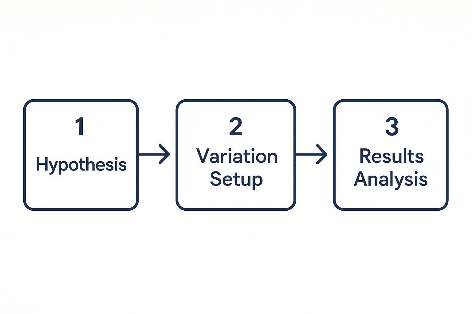
Following this flow ensures your tests are structured, methodical, and produce reliable insights you can build on.
When you've got a list of potential tests, it can be tough to know where to begin. This is where a simple prioritisation framework comes in handy. Score each idea based on its potential impact, your confidence in the hypothesis, and how easy it is to implement.
A/B Testing Idea Prioritisation Framework
| Test Idea (e.g., Change CTA Colour) | Potential Impact (1-5) | Confidence (1-5) | Ease (1-5) | Priority Score (Impact+Confidence+Ease) |
|---|---|---|---|---|
| Update headline to be benefit-driven | 4 | 4 | 5 | 13 |
| Change CTA button colour to green | 3 | 3 | 5 | 11 |
| Replace hero image with a video | 5 | 4 | 2 | 11 |
| Remove one non-essential form field | 4 | 5 | 4 | 13 |
| Redesign entire landing page layout | 5 | 3 | 1 | 9 |
Once you've scored your ideas, just sort the table by the Priority Score. The tests with the highest scores are your starting line.
Analysing Results With Confidence
Once your test has run its course, it's time to pick a winner. The most important metric here is statistical significance, which should ideally be at 95%. This number tells you how confident you can be that the results aren't just a fluke. Whatever you do, don't stop a test early just because one version is ahead—you need enough data to trust the outcome.
It’s just as important to understand the business impact. A 2% lift in conversions on a high-traffic page could translate to thousands in new revenue. This data reinforces why SEO is important; driving qualified traffic to a page you've carefully optimised is where the magic really happens.
And remember, even a "failed" test is a win. If your new version didn't come out on top, your hypothesis was proven wrong. That insight is incredibly valuable. It tells you what doesn't work for your audience, saving you from making a bad decision and helping you come up with a better hypothesis for your next experiment. To help streamline this whole process, check out this brilliant AI-powered A/B testing guide.
Crafting a Value Proposition That Sells Itself

Think of the words on your website as your digital salesperson. They can either build an instant connection that leads to a sale or create enough confusion to send a potential customer clicking away forever. That's the power of conversion copywriting—it’s not about using fancy language, but about communicating your unique value with piercing clarity.
Great copy taps directly into your audience's deepest needs and problems. It’s the difference between a website that just sits there and one that actively persuades and converts. Every headline, product description, and button needs to pull its weight, guiding visitors toward becoming loyal customers.
Write Headlines That Hook Attention
Your headline is the first thing a visitor sees, and if it doesn't grab them, it’ll probably be the last. You have just a few seconds to convince them they’re in the right place. An effective headline has to immediately answer their unspoken question: "What's in it for me?"
Steer clear of vague or clever-sounding headlines that don't communicate a clear benefit. Instead, lead with a powerful promise or a solution to a nagging problem. A strong headline should be almost impossible to ignore.
For example, a self-storage company could go from a bland "Secure Storage Solutions" to something far more compelling like, "Free Up Your Space Today With Our 24/7 Secure Storage Units." The second option speaks directly to the user’s goal while highlighting key features.
Focus on Benefits Over Features
This is one of the oldest rules in copywriting, yet it gets ignored all the time. A feature is what your product is or does—like a laptop having 16GB of RAM. A benefit is what the customer gets because of that feature—like being able to "Effortlessly run all your apps at once without any slowdown."
People don't buy features; they buy better versions of themselves. Your copy needs to paint a vivid picture of how their life will improve once they make a purchase.
Pro Tip: For every feature you list, ask yourself, "So what?" The answer is your benefit. This simple exercise forces you to translate technical specs into tangible customer value, a key technique in effective content marketing for ecommerce.
By framing your offerings this way, you shift the focus from dry details to real-world outcomes, making your product far more desirable.
Craft Calls-to-Action That Create Urgency
Your call-to-action (CTA) is the final hurdle. A weak one can undo all the great work on the rest of the page. Vague phrases like "Submit" or "Click Here" are completely uninspired and do nothing to motivate someone to act.
Your CTA text needs to be specific, action-oriented, and create a subtle sense of urgency without sounding pushy. The goal is to encourage action, not demand it.
Here are a few ways to make your CTAs more compelling:
- Be Specific: Instead of a generic "Download," try "Get My Free Ebook." The user knows exactly what they’re getting.
- Create Scarcity: Phrases like "Limited Spots Available" or "Offer Ends Friday" can motivate immediate action. Just make sure the scarcity is genuine.
- Use First-Person Language: A/B tests have often shown that changing button text from "Start Your Free Trial" to "Start My Free Trial" can increase clicks by giving the user a sense of ownership.
These small tweaks in wording can have a surprisingly big impact on whether a user clicks that button, directly influencing your conversion rates. The words you choose truly matter at every single step.
Common Questions About Increasing Conversion Rates
When you first dive into the world of conversion rate optimisation (CRO), it's easy to get swamped. The field is packed with jargon, data, and a whole lot of nuance. Here, I'll tackle some of the most common questions we hear from UK businesses, giving you clear, straightforward answers to get you on the right track.
Getting these fundamentals right is the key to building a CRO strategy that actually works.
What Is a Good Conversion Rate for a UK Business?
This is the million-dollar question, but the answer isn't a single magic number. Industry benchmarks can offer a rough guide, and for most UK e-commerce sites, a "good" conversion rate typically lands somewhere between 2% and 4%. But honestly, that figure can swing wildly depending on what you sell, your price point, and where your traffic is coming from.
Instead of getting hung up on an arbitrary number, your real focus should be on continuous improvement. A rate that's consistently climbing month after month is a much stronger sign of success. Your most important benchmark is always your own past performance.
Key Insight: Don't obsess over how you stack up against others. The real win is consistently getting better. A rising conversion rate, even from a low starting point, is the hallmark of a healthy, growing business.
How Long Should I Run an A/B Test?
Patience is everything in A/B testing. There’s no universal rule for how long a test should run, but it absolutely must run long enough to achieve two critical things:
- Reach statistical significance: The industry standard is a 95% confidence level. This means you can be 95% certain the results aren't just a random fluke.
- Cover a full business cycle: For most companies, this means running a test for at least one or two full weeks. This simple step helps smooth out any odd performance spikes or dips from different days of the week (think weekend impulse buyers versus weekday researchers).
Whatever you do, don't end a test early just because one version shoots ahead after a day or two. That early lead could easily vanish once you've collected enough data to see the real picture.
Should I Focus on Desktop or Mobile Conversions First?
Your own analytics hold the answer. Take a look at your data and compare how your desktop and mobile traffic performs. More often than not, we see businesses pulling in huge amounts of mobile traffic, but with a mobile conversion rate that's lagging far behind desktop.
If that sounds familiar, start with mobile. Optimising the mobile experience often delivers the biggest and fastest wins because so many sites still aren't built properly for small screens. Fixing those classic mobile friction points—like clunky forms, tiny buttons, or slow-loading images—can give your overall conversion rate a serious boost.
What Is the Single Most Important Element for Conversions?
If I had to boil it all down to one thing, it would be clarity. From the second a visitor lands on your page, they need to be able to answer three questions almost instantly:
- What are you selling?
- Why should I care?
- What do I do next?
This clarity has to be baked into every part of your page—the headline, the value proposition, the images, and especially the call-to-action. If a user feels confused, even for a moment, they're gone. All the clever design and persuasive copy in the world won't save a muddled user journey. For a deeper dive into the complete process, this ultimate conversion rate optimization guide is a fantastic resource.
At Amax Marketing, we specialise in turning website visitors into loyal customers. Our data-driven approach to SEO and conversion rate optimisation can help you unlock your site's true potential. Ready to see what's possible? Get your free marketing audit today.